Data Exploaration
To get the most comprehesive understanding the distribution of violation tickets among NYC, we map all violation to a 3D surface.
read_csv(here::here("data/parking_vio2021_cleanv1.csv")) %>%
drop_na(address) %>%
filter(hour != 12.3) %>%
select(long, lat, hour) %>%
mutate(long = abs(long)) %>%
drop_na() %>%
with(., MASS::kde2d(lat, long)) %>%
as_tibble() %>%
plot_ly() %>%
add_surface(x = ~ x, y = ~ y, z = ~ z) %>%
layout(scene = list(
yaixs = list(autorange = "reversed"),
zaxis = list(
range = c(0.1, 150),
title = "",
showline = FALSE,
showticklabels = FALSE,
showline = FALSE,
showgrid = FALSE
),
camera = list(eye = list(
x = -1.25, y = 1.25, z = 1.25
)),
showlegend = FALSE
))parking %>%
drop_na(borough) %>%
group_by(borough) %>%
summarise(ticket =
n()/nrow(parking)) %>%
arrange(desc(ticket)) %>%
pivot_wider(
names_from = borough,
values_from = ticket
) %>%
knitr::kable()| Manhattan | Brooklyn | Queens | Bronx | Staten Island |
|---|---|---|---|---|
| 0.402 | 0.234 | 0.218 | 0.134 | 0.012 |
We can see that most of the violation ticket issued is concentrated in Manhattan by a large margin, followed by Brooklyn at 23.2%. Staten Island has the least violation ticket issued.
Violation counts vs Time
Once we have the distribution of the issued tickets, we exploring its characteristics. Most of the issued ticket of 2020 by the latest data recording is centered at the 3rd quater, this very strange pattern in the normal time wouldn’t come to a surprise at 2020, as NYC didn’t reopen until late May. Once it reopened, the violation issued increased exponentially. Then the tickets issue started to fall in Sep.
parking %>%
mutate(month = lubridate::month(issue_date),
month = forcats::fct_reorder(as.factor(month),month)
) %>%
drop_na(month,borough) %>%
group_by(borough,month) %>%
summarize(tickets = n()) %>%
ungroup() %>%
mutate(borough = forcats::fct_reorder(borough,tickets,sum)) %>%
ggplot(aes(x = month, y = tickets, fill = borough,group = borough)) +
geom_bar(stat = "identity",position = "dodge") +
labs(
x = 'Issuing Month',
y = 'counts',
title = 'The distribution of tickets quantities over month ')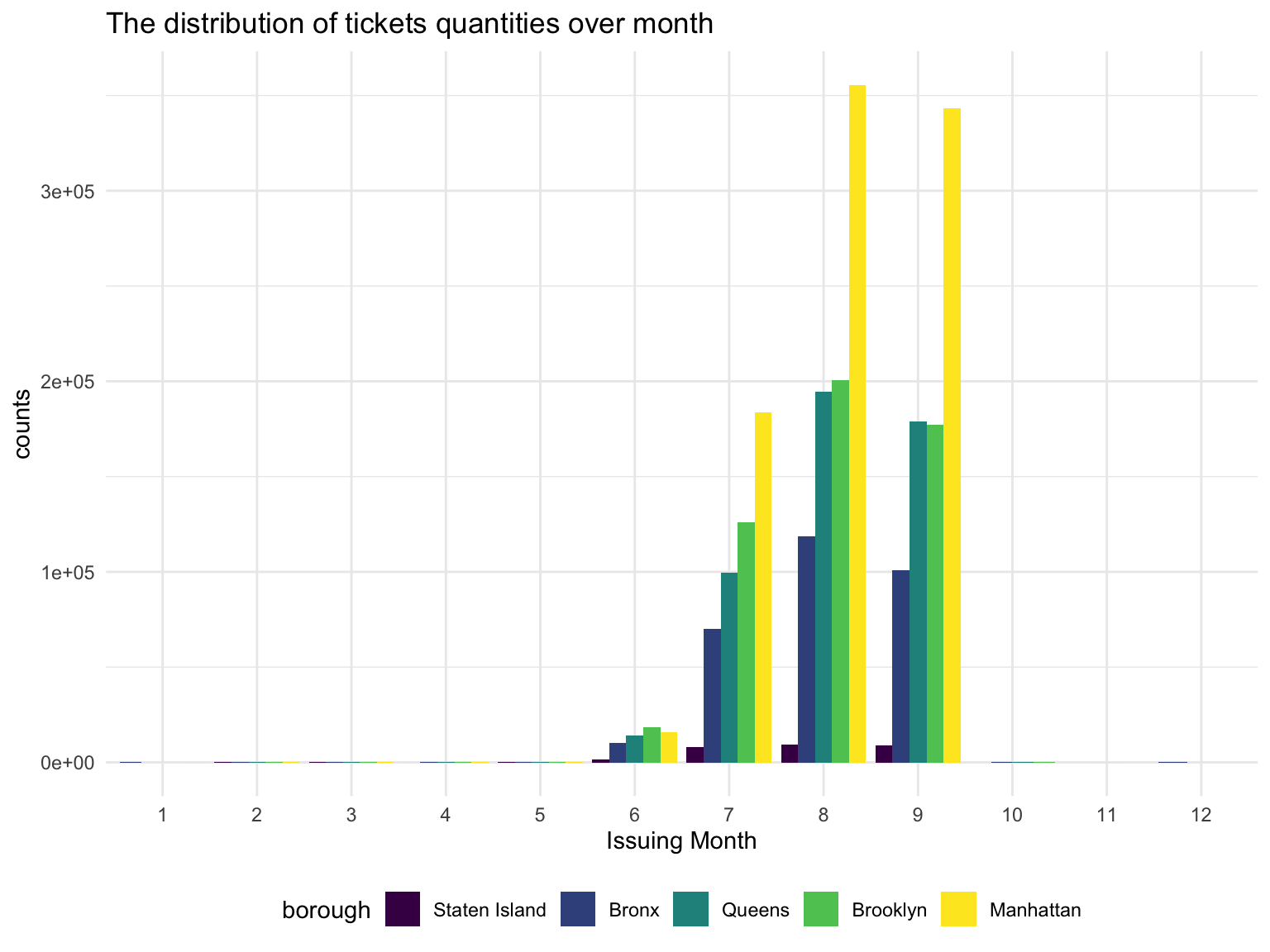
Trend of violation tickets issued during a day can be seen via the animation below. As shown, Violation tickets mostly issued in the daytime. Two peaks are observed in the animation, which is 8 am and 13pm, representing 12.319% and 10.754% tickets issued of the day.
nyc =
parking %>%
drop_na(long, lat) %>%
summarise(
lon_max = max(long),
lon_min = min(long),
lat_max = max(lat),
lat_min = min(lat)
)
nyc =
ggmap::get_map(location = c(
right = pull(nyc, lon_max),
left = pull(nyc, lon_min),
top = pull(nyc, lat_max),
bottom = pull(nyc, lat_min)
))
set.seed(100)
read_csv(here::here("data/parking_vio2021_cleanv1.csv")) %>%
drop_na(address) %>%
filter(hour != 12.3) %>%
filter(hour <= 24) %>%
drop_na(borough,lat,long,hour) %>%
sample_n(1e+5) %>%
mutate(text_label = str_c("borough:", borough, ",address:", address)) %>%
plot_ly() %>%
add_markers(
y = ~ lat,
x = ~ long,
text = ~ text_label,
alpha = 0.02,
frame = ~ hour,
mode = "marker",
color = ~borough,
colors = viridis::viridis(4,option = "C")
) %>%
layout(
images = list(
source = raster2uri(nyc),
xref = "x",
yref = "y",
y = 40.5,
x = -74.28 ,
sizey = 0.4,
sizex = 0.58,
sizing = "stretch",
xanchor = "left",
yanchor = "bottom",
opacity = 0.4,
layer = "below"
)
)%>%
animation_opts(transition = 0,frame = 24)Group by borough, we seen that these trends vary. As in Manhattan, the peaks is similar to the global trend, but other boroughs have a earlier or no second peak. This might reflect the nature of most business center is located in Manhattan, and thus has a larger lunch break group.
parking %>%
group_by(hour,borough) %>%
drop_na(hour,borough) %>%
summarise(n = n()) %>%
plot_ly(x = ~hour, y = ~n, type = 'scatter',mode = 'line', color= ~ borough) %>%
layout(
title = 'Violations per Hour',
xaxis = list(
type = 'category',
title = 'Hour',
range = c(0, 23)),
yaxis = list(
title = 'Count of violations'))Still, we also interested in the tickets generated pattern across weekdays.
According to the figure above, we can see the most obvious pattern is that there are more tickets generated during work days than during weekends . This could be attibuted to two reasons:
1. the overall demand for parking in NYC are smaller during weekend than during weekdays
2. Many parking spots are designed to be free parking during weekends.
All the five boroughs in NYC–Manhattan, Bronx, Brooklyn, Queens and Staten Island have the same trend in the term of parking tickets generating across a week. Manhattan always has the highest parking tickets volume, and follows with Brooklyn, Queens, Bronx and Staten Island.
Violation type
We want to know the most common reason for getting tickets in NYC, and whether there are differences between the five boroughs.
Manhattan
vio_code = readxl::read_xlsx('data/ParkingViolationCodes_January2020.xlsx') %>%
janitor::clean_names() %>%
dplyr::select(violation_code, violation_description) %>%
mutate(violation_description = str_to_lower(violation_description))
vio_count_boro =
parking %>%
left_join(vio_code, by = 'violation_code')
Manhattan_vio =
vio_count_boro %>%
filter(borough == 'Manhattan') %>%
group_by(violation_description) %>%
summarize(n = n()) %>%
mutate(violation_description = fct_reorder(violation_description, n)) %>%
arrange(desc(n)) %>%
head(10) %>%
ggplot(aes(x = violation_description, y = n, fill = violation_description)) +
geom_bar(stat = "identity") +
theme(
axis.text.x = element_text(angle = 90, vjust = .5, hjust = 1),
legend.position = "right",
legend.text = element_text(size = 8)
) +
labs(
title = 'Top 10 violations in Manhattan') +
xlab("violation description") +
ylab('Count of tickets')
Queens_vio =
vio_count_boro %>%
filter(borough == 'Queens') %>%
group_by(violation_description) %>%
summarize(n = n()) %>%
mutate(violation_description = fct_reorder(violation_description, n)) %>%
arrange(desc(n)) %>%
head(10) %>%
ggplot(aes(x = violation_description, y = n, fill = violation_description)) +
geom_bar(stat = "identity") +
theme(
axis.text.x = element_text(angle = 90, vjust = .5, hjust = 1),
legend.position = "right",
legend.text = element_text(size = 8)
) +
labs(
title = 'Top 10 violations in Queens') +
xlab("violation description") +
ylab('Count of tickets')
Bronx_vio =
vio_count_boro %>%
filter(borough == 'Bronx') %>%
group_by(violation_description) %>%
summarize(n = n()) %>%
mutate(violation_description = fct_reorder(violation_description, n)) %>%
arrange(desc(n)) %>%
head(10) %>%
ggplot(aes(x = violation_description, y = n, fill = violation_description)) +
geom_bar(stat = "identity") +
theme(
axis.text.x = element_text(angle = 90, vjust = .5, hjust = 1),
legend.position = "right",
legend.text = element_text(size = 8)
) +
labs(
title = 'Top 10 violations in Bronx') +
xlab("violation description") +
ylab('Count of tickets')
Brooklyn_vio =
vio_count_boro %>%
filter(borough == 'Brooklyn') %>%
group_by(violation_description) %>%
summarize(n = n()) %>%
mutate(violation_description = fct_reorder(violation_description, n)) %>%
arrange(desc(n)) %>%
head(10) %>%
ggplot(aes(x = violation_description, y = n, fill = violation_description)) +
geom_bar(stat = "identity") +
theme(
axis.text.x = element_text(angle = 90, vjust = .5, hjust = 1),
legend.position = "right",
legend.text = element_text(size = 8)
) +
labs(
title = 'Top 10 violations in Brooklyn') +
xlab("violation description") +
ylab('Count of tickets')
Staten_vio =
vio_count_boro %>%
filter(borough == 'Staten Island') %>%
group_by(violation_description) %>%
summarize(n = n()) %>%
mutate(violation_description = fct_reorder(violation_description, n)) %>%
arrange(desc(n)) %>%
head(10) %>%
ggplot(aes(x = violation_description, y = n, fill = violation_description)) +
geom_bar(stat = "identity") +
theme(
axis.text.x = element_text(angle = 90, vjust = .5, hjust = 1),
legend.position = "right",
legend.text = element_text(size = 8)
) +
labs(
title = 'Top 10 violations in Staten Island') +
xlab("violation description") +
ylab('Count of tickets')
Manhattan_vio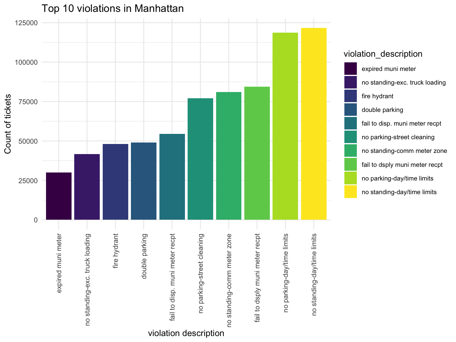
Queen
Queens_vio 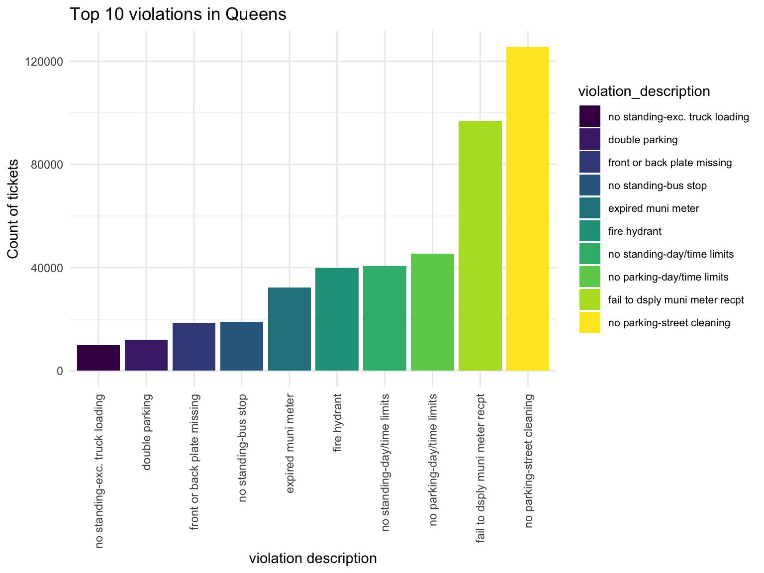
Bronx
Bronx_vio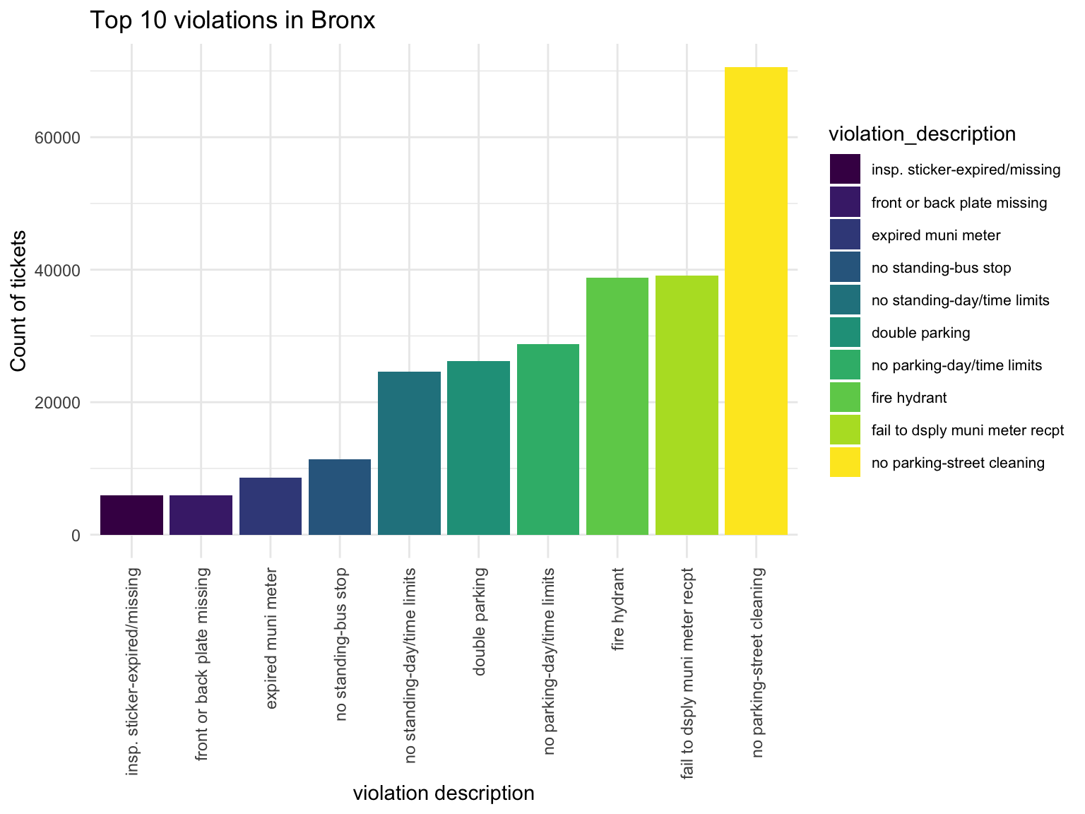
Brooklyn
Brooklyn_vio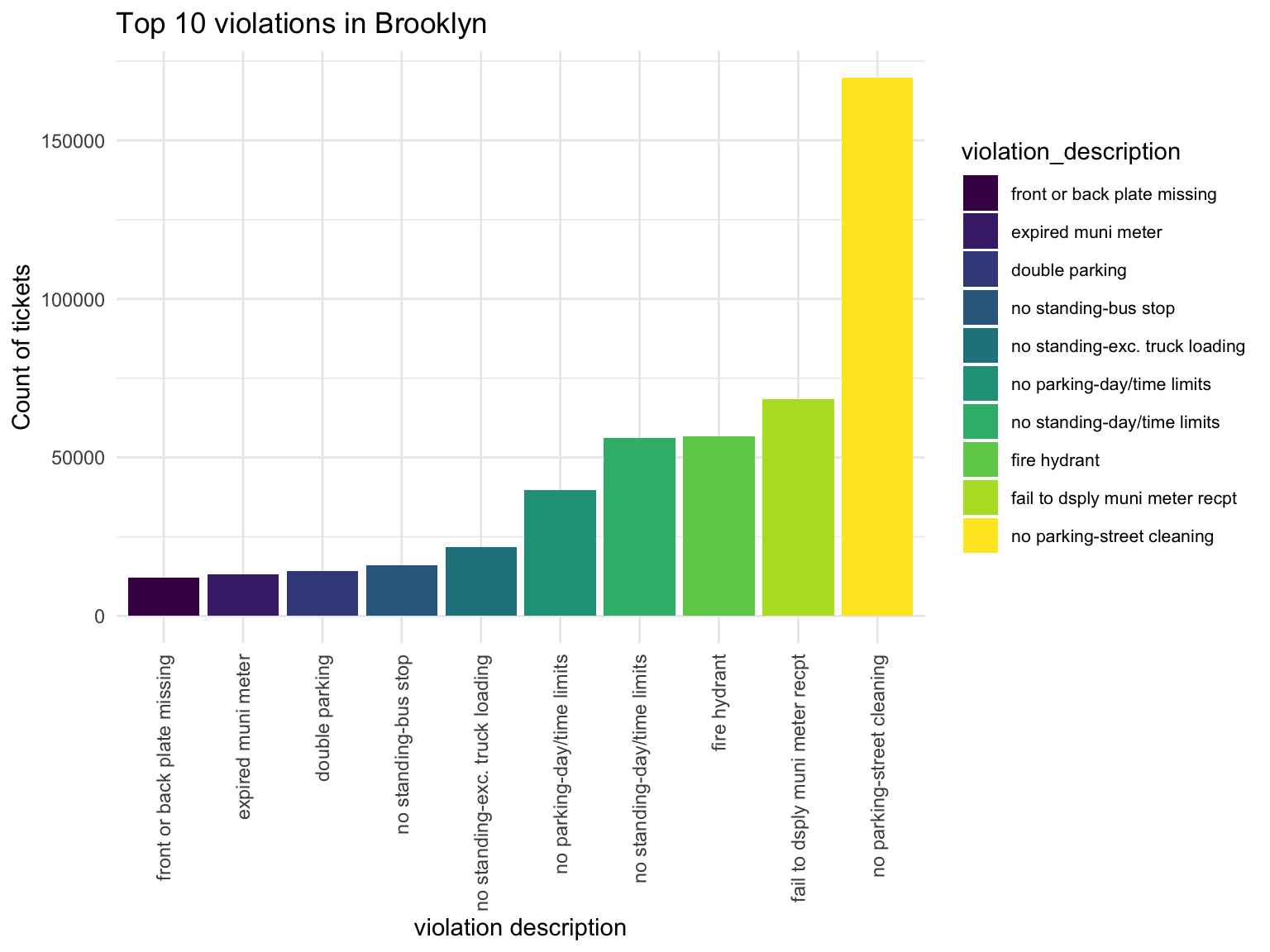
Staten Island
Staten_vio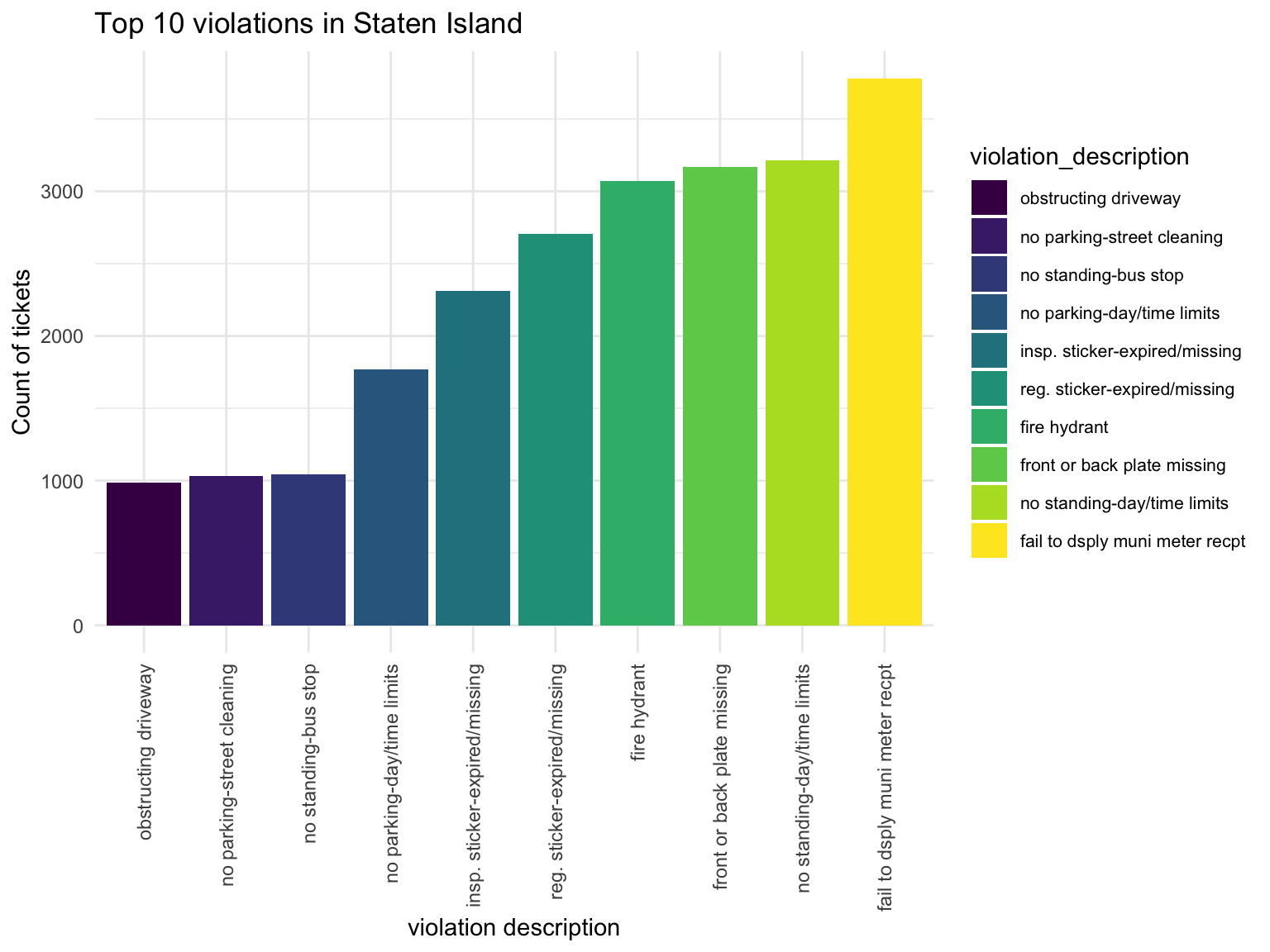
Violation types in each borough also have different compositions. No standing-day/time limit most common type of violation in Manhattan, followed by no parking-day/time. No parking street cleaning is the most common type of violation in Brooklyn, Queen, Bronx, then followed by Fail to display muni meter recept. Noticed that in Brooklyn, Queens and Bronx, the first two types of Violation composist of much higher proportion of violation issued than the rest, whileas the ditribution is more spread out in Manhattan and Staten Island.
Fine amount
It is also necessary to have a overview of the mean of fined in different boroughs, it might give us rough idea about which area is more risky in the term of getting expensive ticket.
As we were motivated by the trouble that New Yorker can get an expensive coffee taxed by the Parking ticket, we need to look at the fine amounts. The Manhattan has the highest mean and the widest variance. Staten Island and Bronx at the first look seems like to have similar ditributions. Further analysis is needed to see if parking violation in Queens may receive a similar fine amount in Brooklyn and etc.
boro_amount = parking %>%
drop_na(fine_amount, borough)%>%
select(borough, fine_amount)%>%
group_by(borough)
parking %>%
drop_na(fine_amount, borough)%>%
select(borough, fine_amount)%>%
group_by(borough) %>%
summarize(mean = mean(fine_amount),
standard_error = sd(fine_amount)) %>%
knitr::kable(caption = "Fine Amount in borough")| borough | mean | standard_error |
|---|---|---|
| Bronx | 75.8 | 35.3 |
| Brooklyn | 70.5 | 33.2 |
| Manhattan | 82.0 | 34.3 |
| Queens | 66.2 | 33.7 |
| Staten Island | 77.8 | 31.2 |
Total amount of fine
Total amount of fine are similar across weekdays in all five boroughs, and see a steep drop on weekend on all borough. Across all boroughs, Manhattan has the highest total fine, Staten Island has the lowest total fine. We see that the proportion of total fine in a day doesn’t change across a week, we need further analysis to see if Monday in Brooklyn have higher total fine than any other day and etc.
day_order = c("Monday", "Tuesday", "Wednesday", "Thursday", "Friday", "Saturday", "Sunday")
parking %>%
dplyr::select(issue_date, fine_amount, borough) %>%
drop_na(issue_date,fine_amount) %>%
mutate(day_week = weekdays(issue_date),
day_week = forcats::fct_relevel(day_week,day_order),
borough = fct_reorder(.f = borough,
.x = fine_amount,
.fun = sum)) %>%
group_by(day_week,borough) %>%
summarise(fine_amount = sum(fine_amount,na.rm = T)) %>%
plot_ly() %>%
add_bars(
x = ~day_week,
y = ~fine_amount,
color = ~borough,
colors = "viridis"
) %>%
layout(
yaxis = list(type = "log"),
title = "Fine amount"
)get_nearby_area =
function(p_long = 0, p_lat = 0,area=100) {
return(
tibble(
long_lwr = p_long - area / (6378137 * cos(pi * p_lat / 180)) * 180 / pi,
long_upr = p_long + area / (6378137 * cos(pi * p_lat / 180)) * 180 /
pi,
lat_lwr = p_lat - area / 6378137 * 180 / pi,
lat_upr = p_lat + area / 6378137 * 180 / pi
)
)
}
get_data =
function(area) {
data =
parking %>%
bind_cols(area) %>%
filter(long < long_upr,
long > long_lwr,
lat < lat_upr,
lat > lat_lwr) %>%
select(summons_number, issue_date, violation_code,hour, vehicle_color, fine_amount)
return(data)
}
nearby_data =
cafe %>%
select(business_name, business_name2, lat, long, borough)%>%
mutate(
nearby = map2(.x = long, .y = lat, ~ get_nearby_area(.x, .y)),
nearby = map(.x = nearby, ~ get_data(.x),
ticket_n = map_dbl(nearby, nrow))) %>%
unnest(nearby)average fine amount distribution
nearby_data %>%
drop_na(borough) %>%
group_by(borough, business_name) %>%
summarize(mean_fine = mean(fine_amount)) %>%
ggplot(aes(x = mean_fine, fill = borough)) +
geom_density(alpha = .5)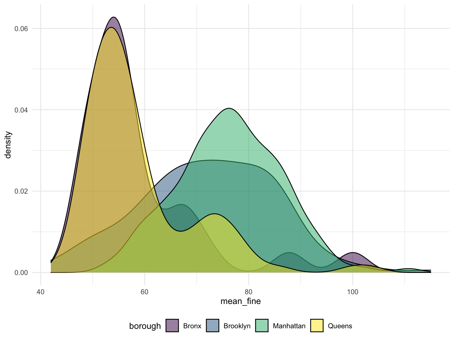
We collect the violation in a 100 meter area around a cafe. and plot them in to a density plot. From this plot, we could find that the risk of violation to get a cup of coffee is much higher in Brooklyn and Manhattan, you might have to pay 80$ for your parking around cafe in most cases. And in Bronx or Queens, the commonly average fine amount around cafe will reduce to 50. However, we don’t get the cafe data in Staten Island, so the situation in Staten Island is unclear.